Visual Design
Visual Design in web development is a broad topic. It combines typography, color theory, graphics, animation, and page layout to help deliver a site’s message. The definition of good design is a well-discussed subject, with many books on the theme.
At a basic level, most web content provides a user with information. The visual design of the page can influence its presentation and a user’s experience. In web development, HTML gives structure and semantics to a page’s content, and CSS controls the layout and appearance of it.
Create Visual Balance Using the text-align Property
Text is often a large part of web content. CSS has several options for how to align it with the text-align property.
text-align: justify; causes all lines of text except the last line to meet the left and right edges of the line box.
text-align: center; centers the text.
text-align: right; right-aligns the text.
text-align: left; (the default) left-aligns the text.
Use the strong Tag to Make Text Bold
To make text bold, you can use the strong tag. This is often used to draw attention to text and symbolize that it is important. With the strong tag, the browser applies the CSS of font-weight: bold; to the element.
Use the u Tag to Underline Text
To underline text, you can use the u tag. This is often used to signify that a section of text is important, or something to remember. With the u tag, the browser applies the CSS of text-decoration: underline; to the element.
Note: Try to avoid using the
utag when it could be confused for a link. Anchor tags also have a default underlined formatting.
Use the em Tag to Italicize Text
To emphasize text, you can use the em tag. This displays text as italicized, as the browser applies the CSS of font-style: italic; to the element.
Use the s Tag to Strikethrough Text
To strikethrough text, which is when a horizontal line cuts across the characters, you can use the s tag. It shows that a section of text is no longer valid. With the s tag, the browser applies the CSS of text-decoration: line-through; to the element.
Create a Horizontal Line Using the hr Element
You can use the hr tag to add a horizontal line across the width of its containing element. This can be used to define a change in topic or to visually separate groups of content.
Adjust the background-color Property of Text
Instead of adjusting your overall background or the color of the text to make the foreground easily readable, you can add a background-color to the element holding the text you want to emphasize.
rgba stands for:
- r = red
- g = green
- b = blue
- a = alpha/level of opacity
The RGB values can range from 0 to 255. The alpha value can range from 1, which is fully opaque or a solid color, to 0, which is fully transparent or clear. rgba() is great to use in this case, as it allows you to adjust the opacity. This means you don’t have to completely block out the background.
For instance, you can use background-color: rgba(45, 45, 45, 0.1). It produces a dark gray color that is nearly transparent given the low opacity value of 0.1.
Adjust the Size of a Header Versus a Paragraph Tag
The font size of header tags (h1 through h6) should generally be larger than the font size of paragraph tags. This makes it easier for the user to visually understand the layout and level of importance of everything on the page. You can also use the font-size property to adjust the size of the text in an element.
Add a box-shadow to a Card-like Element
The box-shadow property applies one or more shadows to an element.
The box-shadow property takes values for:
- offset-x (how far to push the shadow horizontally from the element)
- offset-y (how far to push the shadow vertically from the element)
- blur-radius
- spread-radius
- color
The blur-radius and spread-radius values are optional.
Multiple box-shadows can be created by using commas to separate properties of each box-shadow element.
Here’s an example of the CSS to create multiple shadows with some blur, at mostly-transparent black colors: box-shadow: 0 10px 20px rgba(0,0,0,0.19), 0 6px.
Decrease the Opacity of an Element
The opacity property in CSS is used to adjust the opacity, or conversely, the transparency for an item.
A value of 1 is opaque, which isn’t transparent at all.
A value of 0.5 is half see-through.
A value of 0 is completely transparent.
The value given will apply to the entire element, whether that’s an image with some transparency, or the foreground and background colors for a block of text.
Use the text-transform Property to Make Text Uppercase
The text-transform property in CSS is used to change the appearance of text. It’s a convenient way to make sure text on a webpage appears consistently, without having to change the text content of the actual HTML elements.
The following table shows how the different text-transform values change the example text “Transform me”.
| Value | Result |
|---|---|
| lowercase | “transform me” |
| uppercase | “TRANSFORM ME” |
| capitalize | “Transform Me” |
| initial | Use the default value |
| inherit | Use the text-transform value from the parent element |
| none | Default: Use the original text |
<style>
  h4 {
    text-align: center;
    background-color: rgba(45, 45, 45, 0.1);
    padding: 10px;
    font-size: 27px;
    text-transform: uppercase;
  }
  p {
    text-align: justify;
  }
  .links {
    text-align: left;
    color: black;
    opacity: 0.7;
  }
  #thumbnail {
    box-shadow: 0 10px 20px rgba(0,0,0,0.19), 0 6px 6px rgba(0,0,0,0.23);
  }
  .fullCard {
    width: 245px;
    border: 1px solid #ccc;
    border-radius: 5px;
    margin: 10px 5px;
    padding: 4px;
  }
  .cardContent {
    padding: 10px;
  }
  .cardText {
    margin-bottom: 30px;
  }
</style>
<div class="fullCard" id="thumbnail">
  <div class="cardContent">
    <div class="cardText">
      <h4>Alphabet</h4>
      <hr>
      <p><em>Google was founded by Larry Page and Sergey Brin while they were <u>Ph.D. students</u> at <strong>Stanford University</strong>.</em></p>
    </div>
    <div class="cardLinks">
      <a href="https://en.wikipedia.org/wiki/Larry_Page" target="_blank" class="links">Larry Page</a><br><br>
      <a href="https://en.wikipedia.org/wiki/Sergey_Brin" target="_blank" class="links">Sergey Brin</a>
    </div>
  </div>
</div>
Set the font-size for Multiple Heading Elements
The font-size property is used to specify how large the text is in a given element. This rule can be used for multiple elements to create visual consistency of text on a page.
The font-size property in CSS is not limited to headings, it can be applied to any element containing text.
Set the font-weight for Multiple Heading Elements
The font-weight property sets how thick or thin characters are in a section of text.
<style>
  h1 {
    font-size: 68px;
    font-weight: 800;
  }
  h2 {
    font-size: 52px;
    font-weight: 600;
  }
  h3 {
    font-size: 40px;
    font-weight: 500;
  }
  h4 {
    font-size: 32px;
    font-weight: 400;
  }
  h5 {
    font-size: 21px;
    font-weight: 300;
  }
  h6 {
    font-size: 14px;
    font-weight: 200;
  }
</style>
<h1>This is h1 text</h1>
<h2>This is h2 text</h2>
<h3>This is h3 text</h3>
<h4>This is h4 text</h4>
<h5>This is h5 text</h5>
<h6>This is h6 text</h6>
Set the line-height of Paragraphs
CSS offers the line-height property to change the height of each line in a block of text. As the name suggests, it changes the amount of vertical space that each line of text gets.
<style>
  p {
    font-size: 16px;
    line-height: 25px;
  }
</style>
<p>
  Lorem ipsum dolor sit amet, consectetur adipiscing elit, sed do eiusmod tempor incididunt ut labore et dolore magna aliqua. Ut enim ad minim veniam, quis nostrud exercitation ullamco laboris nisi ut aliquip ex ea commodo consequat. Duis aute irure dolor in reprehenderit in voluptate velit esse cillum dolore eu fugiat nulla pariatur.
</p>
Adjust the Hover State of an Anchor Tag
A pseudo-class is a keyword that can be added to selectors, in order to select a specific state of the element.
For example, the styling of an anchor tag can be changed for its hover state using the :hover pseudo-class selector. Here’s the CSS to change the color of the anchor tag to red during its hover state:
a:hover {
  color: red;
}
Change an Element’s Relative Position
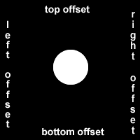
CSS treats each HTML element as its own box, which is usually referred to as the CSS Box Model. Block-level items automatically start on a new line (think headings, paragraphs, and divs) while inline items sit within surrounding content (like images or spans). The default layout of elements in this way is called the normal flow of a document, but CSS offers the position property to override it.
When the position of an element is set to relative, it allows you to specify how CSS should move it relative to its current position in the normal flow of the page. It pairs with the CSS offset properties of left or right, and top or bottom. These say how many pixels, percentages, or ems to move the item away from where it is normally positioned. The following example moves the paragraph 10 pixels away from the bottom:
p {
  position: relative;
  bottom: 10px;
}
Changing an element’s position to relative does not remove it from the normal flow - other elements around it still behave as if that item were in its default position.
Note: Positioning gives you a lot of flexibility and power over the visual layout of a page. It’s good to remember that no matter the position of elements, the underlying HTML markup should be organized and make sense when read from top to bottom. This is how users with visual impairments (who rely on assistive devices like screen readers) access your content.
The CSS offsets of top or bottom, and left or right tell the browser how far to offset an item relative to where it would sit in the normal flow of the document. You’re offsetting an element away from a given spot, which moves the element away from the referenced side (effectively, the opposite direction).
Lock an Element to its Parent with Absolute Positioning
The next option for the CSS position property is absolute, which locks the element in place relative to its parent container. Unlike the relative position, this removes the element from the normal flow of the document, so surrounding items ignore it. The CSS offset properties (top or bottom and left or right) are used to adjust the position.
One nuance with absolute positioning is that it will be locked relative to its closest positioned ancestor. If you forget to add a position rule to the parent item, (this is typically done using position: relative;), the browser will keep looking up the chain and ultimately default to the body tag.
Lock an Element to the Browser Window with Fixed Positioning
The next layout scheme that CSS offers is the fixed position, which is a type of absolute positioning that locks an element relative to the browser window. Similar to absolute positioning, it’s used with the CSS offset properties and also removes the element from the normal flow of the document. Other items no longer “realize” where it is positioned, which may require some layout adjustments elsewhere.
One key difference between the fixed and absolute positions is that an element with a fixed position won’t move when the user scrolls.
  #navbar {
    position: fixed;
    top: 0px;
    left: 0px;
  }
Push Elements Left or Right with the float Property
The next positioning tool does not actually use position, but sets the float property of an element. Floating elements are removed from the normal flow of a document and pushed to either the left or right of their containing parent element. It’s commonly used with the width property to specify how much horizontal space the floated element requires.
<head>
  <style>
    #left {
      float: left;
      width: 50%;
    }
    #right {
      float: right;
      width: 40%;
    }
    aside, section {
      padding: 2px;
      background-color: #ccc;
    }
  </style>
</head>
<body>
  <header>
    <h1>Welcome!</h1>
  </header>
  <section id="left">
    <h2>Content</h2>
    <p>Good stuff</p>
  </section>
  <aside id="right">
    <h2>Sidebar</h2>
    <p>Links</p>
  </aside>
</body>
Change the Position of Overlapping Elements with the z-index Property
When elements are positioned to overlap (i.e. using position: absolute |
relative |
fixed |
sticky), the element coming later in the HTML markup will, by default, appear on the top of the other elements. However, the z-index property can specify the order of how elements are stacked on top of one another. It must be an integer (i.e. a whole number and not a decimal), and higher values for the z-index property of an element move it higher in the stack than those with lower values. |
Center an Element Horizontally Using the margin Property
Another positioning technique is to center a block element horizontally. One way to do this is to set its margin to a value of auto.
This method works for images, too. Images are inline elements by default, but can be changed to block elements when you set the display property to block.
  div {
    height: 100px;
    width: 100px;
    margin: auto;
  }
Learn about Complementary Colors
On a website, color can draw attention to content, evoke emotions, or create visual harmony. Using different combinations of colors can really change the look of a website, and a lot of thought can go into picking a color palette that works with your content.
The color wheel is a useful tool to visualize how colors relate to each other - it’s a circle where similar hues are neighbors and different hues are farther apart. When two colors are opposite each other on the wheel, they are called complementary colors. They have the characteristic that if they are combined, they “cancel” each other out and create a gray color. However, when placed side-by-side, these colors appear more vibrant and produce a strong visual contrast.
Some examples of complementary colors with their hex codes are:
- red (
#FF0000) and cyan (#00FFFF) - green (
#00FF00) and magenta (#FF00FF) - blue (
#0000FF) and yellow (#FFFF00)
This is different than the outdated RYB color model that many of us were taught in school, which has different primary and complementary colors. Modern color theory uses the additive RGB model (like on a computer screen) and the subtractive CMY(K) model (like in printing).
There are many color picking tools available online that have an option to find the complement of a color.
Note: Using color can be a powerful way to add visual interest to a page. However, color alone should not be used as the only way to convey important information because users with visual impairments may not understand that content.
Learn about Tertiary Colors
Computer monitors and device screens create different colors by combining amounts of red, green, and blue light. This is known as the RGB additive color model in modern color theory. Red (R), green (G), and blue (B) are called primary colors. Mixing two primary colors creates the secondary colors cyan (G + B), magenta (R + B) and yellow (R + G). You saw these colors in the Complementary Colors challenge. These secondary colors happen to be the complement to the primary color not used in their creation, and are opposite to that primary color on the color wheel. For example, magenta is made with red and blue, and is the complement to green.
Tertiary colors are the result of combining a primary color with one of its secondary color neighbors. For example, within the RGB color model, red (primary) and yellow (secondary) make orange (tertiary). This adds six more colors to a simple color wheel for a total of twelve.
There are various methods of selecting different colors that result in a harmonious combination in design. One example that can use tertiary colors is called the split-complementary color scheme. This scheme starts with a base color, then pairs it with the two colors that are adjacent to its complement. The three colors provide strong visual contrast in a design, but are more subtle than using two complementary colors.
Here are three colors created using the split-complement scheme:
Color Hex Code
- orange
#FF7F00 - cyan
#00FFFF - raspberry
#FF007F
Adjust the Color of Various Elements to Complementary Colors
The Complementary Colors challenge showed that opposite colors on the color wheel can make each other appear more vibrant when placed side-by-side. However, the strong visual contrast can be jarring if it’s overused on a website, and can sometimes make text harder to read if it’s placed on a complementary-colored background. In practice, one of the colors is usually dominant and the complement is used to bring visual attention to certain content on the page.
<style>
body {
background-color: white;
}
header {
background-color: #09A7A1;
color: white;
padding: 0.25em;
}
h2 {
color: #09A7A1;
}
button {
background-color: #FF790E;
}
footer {
background-color: #09A7A1;
color: white;
padding: 0.5em;
}
</style>
<header>
<h1>Cooking with FCC!</h1>
</header>
<main>
<article>
<h2>Machine Learning in the Kitchen</h2>
<p>Join this two day workshop that walks through how to implement cutting-edge snack-getting algorithms with a command line interface. Coding usually involves writing exact instructions, but sometimes you need your computer to execute flexible commands, like <code>fetch Pringles</code>.</p>
<button>Sign Up</button>
</article>
<article>
<h2>Bisection Vegetable Chopping</h2>
<p>This week-long retreat will level-up your coding ninja skills to actual ninja skills. No longer is the humble bisection search limited to sorted arrays or coding interview questions, applying its concepts in the kitchen will have you chopping carrots in O(log n) time before you know it.</p>
<button>Sign Up</button>
</article>
</main>
<br>
<footer>© 2018 FCC Kitchen</footer>
Adjust the Hue of a Color
Colors have several characteristics including hue, saturation, and lightness. CSS3 introduced the hsl() property as an alternative way to pick a color by directly stating these characteristics.
Hue is what people generally think of as ‘color’. If you picture a spectrum of colors starting with red on the left, moving through green in the middle, and blue on right, the hue is where a color fits along this line. In hsl(), hue uses a color wheel concept instead of the spectrum, where the angle of the color on the circle is given as a value between 0 and 360.
Saturation is the amount of gray in a color. A fully saturated color has no gray in it, and a minimally saturated color is almost completely gray. This is given as a percentage with 100% being fully saturated.
Lightness is the amount of white or black in a color. A percentage is given ranging from 0% (black) to 100% (white), where 50% is the normal color.
Here are a few examples of using hsl() with fully-saturated, normal lightness colors:
Color HSL
red hsl(0, 100%, 50%)
yellow hsl(60, 100%, 50%)
green hsl(120, 100%, 50%)
cyan hsl(180, 100%, 50%)
blue hsl(240, 100%, 50%)
magenta hsl(300, 100%, 50%)
Adjust the Tone of a Color
The hsl() option in CSS also makes it easy to adjust the tone of a color. Mixing white with a pure hue creates a tint of that color, and adding black will make a shade. Alternatively, a tone is produced by adding gray or by both tinting and shading. Recall that the ‘s’ and ‘l’ of hsl() stand for saturation and lightness, respectively. The saturation percent changes the amount of gray and the lightness percent determines how much white or black is in the color. This is useful when you have a base hue you like, but need different variations of it.
<style>
  header {
    background-color: hsl(180, 90%, 35%);
    color: #FFFFFF;
  }

  nav {
    background-color: hsl(180, 80%, 25%);
  }

  h1 {
    text-indent: 10px;
    padding-top: 10px;
  }

  nav ul {
    margin: 0px;
    padding: 5px 0px 5px 30px;
  }

  nav li {
    display: inline;
    margin-right: 20px;
  }

  a {
    text-decoration: none;
    color: inherit;
  }
</style>

<header>
  <h1>Cooking with FCC!</h1>
  <nav>
    <ul>
      <li><a href="#">Home</a></li>
      <li><a href="#">Classes</a></li>
      <li><a href="#">Contact</a></li>
    </ul>
  </nav>
</header>
Create a Gradual CSS Linear Gradient
Applying a color on HTML elements is not limited to one flat hue. CSS provides the ability to use color transitions, otherwise known as gradients, on elements. This is accessed through the background property’s linear-gradient() function. Here is the general syntax: background: linear-gradient(gradient_direction, color 1, color 2, color 3, ...);
The first argument specifies the direction from which color transition starts - it can be stated as a degree, where 90deg makes a vertical gradient and 45deg is angled like a backslash. The following arguments specify the order of colors used in the gradient. Example: background: linear-gradient(90deg, red, yellow, rgb(204, 204, 255));
<style>
  div {
    border-radius: 20px;
    width: 70%;
    height: 400px;
    margin: 50px auto;
    background: linear-gradient(35deg, #CCFFFF, #FFCCCC);
  }
</style>

<div></div>
Use a CSS Linear Gradient to Create a Striped Element
The repeating-linear-gradient() function is very similar to linear-gradient() with the major difference that it repeats the specified gradient pattern. repeating-linear-gradient() accepts a variety of values.
The angle value is the direction of the gradient. Color stops are like width values that mark where a transition takes place, and are given with a percentage or a number of pixels.
In the example below, the gradient starts with the color yellow at 0 pixels which blends into the second color blue at 40 pixels away from the start. Since the next color stop is also at 40 pixels, the gradient immediately changes to the third color green, which itself blends into the fourth color value red as that is 80 pixels away from the beginning of the gradient.
For this example, it helps to think about the color stops as pairs where every two colors blend together.
0px [yellow -- blend -- blue] 40px [green -- blend -- red] 80px
If every two color stop values are the same color, the blending isn’t noticeable because it’s between the same color, followed by a hard transition to the next color, so you end up with stripes.
<style>

  div{
    border-radius: 20px;
    width: 70%;
    height: 400px;
    margin:  50 auto;
    background: repeating-linear-gradient(
      45deg,
      yellow 0px,
      yellow 40px,
      black 40px,
      black 80px
    );
  }

</style>

<div></div>
Create Texture by Adding a Subtle Pattern as a Background Image
One way to add texture and interest to a background and have it stand out more is to add a subtle pattern. The key is balance, as you don’t want the background to stand out too much, and take away from the foreground. The background property supports the url() function in order to link to an image of the chosen texture or pattern. The link address is wrapped in quotes inside the parentheses.
<style>
  body {
    background: url("https://cdn-media-1.freecodecamp.org/imgr/MJAkxbh.png");
  }
</style>
Use the CSS Transform scale Property to Change the Size of an Element
To change the scale of an element, CSS has the transform property, along with its scale() function. The following code example doubles the size of all the paragraph elements on the page:
p {
  transform: scale(2);
}
Use the CSS Transform scale Property to Scale an Element on Hover
The transform property has a variety of functions that let you scale, move, rotate, skew, etc. When used with pseudo-classes such as :hover that specify a certain state of an element, the transform property can easily add interactivity to your elements.
Here’s an example to scale the paragraph elements to 2.1 times their original size when a user hovers over them:
p:hover {
  transform: scale(2.1);
}
Note: Applying a transform to a div element will also affect any child elements contained in the div.
<style>
  div {
    width: 70%;
    height: 100px;
    margin:  50px auto;
    background: linear-gradient(
      53deg,
      #ccfffc,
      #ffcccf
    );
  }
  div:hover {
    transform: scale(1.1);
  }
</style>

<div></div>
Use the CSS Transform Property skewX to Skew an Element Along the X-Axis
The next function of the transform property is skewX(), which skews the selected element along its X (horizontal) axis by a given degree.
The following code skews the paragraph element by -32 degrees along the X-axis.
p {
  transform: skewX(-32deg);
}
Use the CSS Transform Property skewY to Skew an Element Along the Y-Axis
Given that the skewX() function skews the selected element along the X-axis by a given degree, it is no surprise that the skewY() property skews an element along the Y (vertical) axis.
Create a Graphic Using CSS
By manipulating different selectors and properties, you can make interesting shapes. One of the easier ones to try is a crescent moon shape. For this challenge you need to work with the box-shadow property that sets the shadow of an element, along with the border-radius property that controls the roundness of the element’s corners.
You will create a round, transparent object with a crisp shadow that is slightly offset to the side - the shadow is actually going to be the moon shape you see.
In order to create a round object, the border-radius property should be set to a value of 50%.
You may recall from an earlier challenge that the box-shadow property takes values for offset-x, offset-y, blur-radius, spread-radius and a color value in that order. The blur-radius and spread-radius values are optional.
<style>
  .center {
    position: absolute;
    margin: auto;
    top: 0;
    right: 0;
    bottom: 0;
    left: 0;
    width: 100px;
    height: 100px;
    background-color: transparent;
    border-radius: 50%;
    box-shadow: 25px 10px 0 0 blue;
  }
</style>

<div class="center"></div>
Create a More Complex Shape Using CSS and HTML
One of the most popular shapes in the world is the heart shape, and you can create one using pure CSS. But first, you need to understand the ::before and ::after pseudo-elements. These pseudo-elements are used to add something before or after a selected element. In the following example, a ::before pseudo-element is used to add a rectangle to an element with the class heart.
.heart::before {
  content: "";
  background-color: yellow;
  border-radius: 25%;
  position: absolute;
  height: 50px;
  width: 70px;
  top: -50px;
  left: 5px;
}
For the ::before and ::after pseudo-elements to function properly, they must have a defined content property. This property is usually used to add things like a photo or text to the selected element. When the ::before and ::after pseudo-elements are used to make shapes, the content property is still required, but it’s set to an empty string. In the above example, the element with the class of heart has a ::before pseudo-element that produces a yellow rectangle with height and width of 50px and 70px, respectively. This rectangle has round corners due to its 25% border radius and is positioned absolutely at 5px from the left and 50px above the top of the element.
<style>
  .heart {
    position: absolute;
    margin: auto;
    top: 0;
    right: 0;
    bottom: 0;
    left: 0;
    background-color: pink;
    height: 50px;
    width: 50px;
    transform: rotate(-45deg);
  }
  .heart::after {
    background-color: pink;
    content: "";
    border-radius: 50%;
    position: absolute;
    width: 50px;
    height: 50px;
    top: 0px;
    left: 25px;
  }
  .heart::before {
    content: '';
    background-color: pink;
    border-radius: 50%;
    position: absolute;
    width: 50px;
    height: 50px;
    top: -25px;
    left: 0px;
  }
</style>

<div class="heart"></div>
Learn How the CSS @keyframes and animation Properties Work
To animate an element, you need to know about the animation properties and the @keyframes rule. The animation properties control how the animation should behave and the @keyframes rule controls what happens during that animation. There are eight animation properties in total. The two most important ones are:
animation-nameSets the name of the animation, which is later used by@keyframesto tell CSS which rules go with which animations.animation-durationSets the length of time for the animation.
@keyframes is how to specify exactly what happens within the animation over the duration. This is done by giving CSS properties for specific “frames” during the animation, with percentages ranging from 0% to 100%. If you compare this to a movie, the CSS properties for 0% is how the element displays in the opening scene. The CSS properties for 100% is how the element appears at the end, right before the credits roll. Then CSS applies the magic to transition the element over the given duration to act out the scene. Here’s an example to illustrate the usage of @keyframes and the animation properties:
#anim {
  animation-name: colorful;
  animation-duration: 3s;
}

@keyframes colorful {
  0% {
    background-color: blue;
  }
  100% {
    background-color: yellow;
  }
}
For the element with the anim id, the code snippet above sets the animation-name to colorful and sets the animation-duration to 3 seconds. Then the @keyframes rule links to the animation properties with the name colorful. It sets the color to blue at the beginning of the animation (0%) which will transition to yellow by the end of the animation (100%). You aren’t limited to only beginning-end transitions, you can set properties for the element for any percentage between 0% and 100%.
<style>
  div {
    height: 40px;
    width: 70%;
    background: yellow;
    margin: 50px auto;
    border-radius: 5px;
  }

  #rect {
    animation-name: rainbow;
    animation-duration: 9s;
  }

  @keyframes rainbow {
    0% {
      background-color: blue;
    }
    50% {
      background-color: green;
    }
    100% {
      background-color: yellow;
    }
  }
</style>
<div id="rect"></div>
Use CSS Animation to Change the Hover State of a Button
You can use CSS @keyframes to change the color of a button in its hover state.
Here’s an example of changing the width of an image on hover:
<style>
  img:hover {
    animation-name: width;
    animation-duration: 500ms;
  }

  @keyframes width {
    100% {
      width: 40px;
    }
  }
</style>

<img src="https://bit.ly/smallgooglelogo" alt="Google's Logo" />
Note that ms stands for milliseconds, where 1000ms is equal to 1s.
<style>
  button {
    border-radius: 5px;
    color: white;
    background-color: #0F5897;
    padding: 5px 10px 8px 10px;
  }

  button:hover {
    animation-name: background-color;
    animation-duration: 500ms;
  }

  @keyframes background-color {
    100% {
      background-color: #4791d0;
    }
  }
</style>

<button>Register</button>
Modify Fill Mode of an Animation
That’s great, but it doesn’t work right yet. Notice how the animation resets after 500ms has passed, causing the button to revert back to the original color. You want the button to stay highlighted.
This can be done by setting the animation-fill-mode property to forwards. The animation-fill-mode specifies the style applied to an element when the animation has finished. You can set it like so:
animation-fill-mode: forwards;
Set the animation-fill-mode property of button:hover to forwards so the button stays highlighted when a user hovers over it.
<style>
  button {
    border-radius: 5px;
    color: white;
    background-color: #0F5897;
    padding: 5px 10px 8px 10px;
  }
  button:hover {
    animation-name: background-color;
    animation-duration: 500ms;
    animation-fill-mode: forwards;
  }
  @keyframes background-color {
    100% {
      background-color: #4791d0;
    }
  }
</style>
<button>Register</button>
Create Movement Using CSS Animation
When elements have a specified position, such as fixed or relative, the CSS offset properties right, left, top, and bottom can be used in animation rules to create movement.
As shown in the example below, you can push the item downwards then upwards by setting the top property of the 50% keyframe to 50px, but having it set to 0px for the first (0%) and the last (100%) keyframe.
@keyframes rainbow {
  0% {
    background-color: blue;
    top: 0px;
  }
  50% {
    background-color: green;
    top: 50px;
  }
  100% {
    background-color: yellow;
    top: 0px;
  }
}
<style>
  div {
    height: 40px;
    width: 70%;
    background: black;
    margin: 50px auto;
    border-radius: 5px;
    position: relative;
  }

  #rect {
    animation-name: rainbow;
    animation-duration: 4s;
  }

  @keyframes rainbow {
    0% {
      background-color: blue;
      top: 0px;
      left: 0px;
    }
    50% {
      background-color: green;
      top: 50px;
      left: 25px;
    }
    100% {
      background-color: yellow;
      top: 0px;
      left: -25px;
    }
  }
</style>

<div id="rect"></div>
Create Visual Direction by Fading an Element from Left to Right
You can change the opacity of an animated element so it gradually fades as it reaches the right side of the screen.
In the animation below, the round element with the gradient background moves to the right by the 50% mark of the animation per the @keyframes rule.
<style>

  #ball {
    width: 70px;
    height: 70px;
    margin: 50px auto;
    position: fixed;
    left: 20%;
    border-radius: 50%;
    background: linear-gradient(
      35deg,
      #ccffff,
      #ffcccc
    );
    animation-name: fade;
    animation-duration: 3s;
  }

  @keyframes fade {
    50% {
      left: 60%;
      opacity: 0.1;
    }
  }

</style>

<div id="ball"></div>
Animate Elements Continually Using an Infinite Animation Count
Another animation property is the animation-iteration-count, which allows you to control how many times you would like to loop through the animation. Here’s an example:
animation-iteration-count: 3;
In this case the animation will stop after running 3 times, but it’s possible to make the animation run continuously by setting that value to infinite.
To keep the ball bouncing on the right on a continuous loop, change the animation-iteration-count property to infinite.
<style>

  #ball {
    width: 100px;
    height: 100px;
    margin: 50px auto;
    position: relative;
    border-radius: 50%;
    background: linear-gradient(
      35deg,
      #ccffff,
      #ffcccc
    );
    animation-name: bounce;
    animation-duration: 1s;
    animation-iteration-count: infinite;
  }

  @keyframes bounce{
    0% {
      top: 0px;
    }
    50% {
      top: 249px;
      width: 130px;
      height: 70px;
    }
    100% {
      top: 0px;
    }
  }
</style>
<div id="ball"></div>
Make a CSS Heartbeat using an Infinite Animation Count
The one-second long heartbeat animation consists of two animated pieces. The heart elements (including the ::before and ::after pieces) are animated to change size using the transform property, and the background div is animated to change its color using the background property.
<style>
  .back {
    position: fixed;
    padding: 0;
    margin: 0;
    top: 0;
    left: 0;
    width: 100%;
    height: 100%;
    background: white;
    animation-name: backdiv;
    animation-duration: 1s;
    animation-iteration-count: infinite;
  }

  .heart {
    position: absolute;
    margin: auto;
    top: 0;
    right: 0;
    bottom: 0;
    left: 0;
    background-color: pink;
    height: 50px;
    width: 50px;
    transform: rotate(-45deg);
    animation-name: beat;
    animation-duration: 1s;
    animation-iteration-count: infinite;
  }

  .heart:after {
    background-color: pink;
    content: "";
    border-radius: 50%;
    position: absolute;
    width: 50px;
    height: 50px;
    top: 0px;
    left: 25px;
  }

  .heart:before {
    background-color: pink;
    content: "";
    border-radius: 50%;
    position: absolute;
    width: 50px;
    height: 50px;
    top: -25px;
    left: 0px;
  }

  @keyframes backdiv {
    50% {
      background: #ffe6f2;
    }
  }

  @keyframes beat {
    0% {
      transform: scale(1) rotate(-45deg);
    }
    50% {
      transform: scale(0.6) rotate(-45deg);
    }
  }

</style>
<div class="back"></div>
<div class="heart"></div>
Animate Elements at Variable Rates
There are a variety of ways to alter the animation rates of similarly animated elements. So far, this has been achieved by applying an animation-iteration-count property and setting @keyframes rules.
To illustrate, the animation on the right consists of two “stars” that each decrease in size and opacity at the 20% mark in the @keyframes rule, which creates the twinkle animation. You can change the @keyframes rule for one of the elements so the stars twinkle at different rates.
<style>
  .stars {
    background-color: white;
    height: 30px;
    width: 30px;
    border-radius: 50%;
    animation-iteration-count: infinite;
  }

  .star-1 {
    margin-top: 15%;
    margin-left: 60%;
    animation-name: twinkle-1;
    animation-duration: 1s;
  }

  .star-2 {
    margin-top: 25%;
    margin-left: 25%;
    animation-name: twinkle-2;
    animation-duration: 1s;
  }

  @keyframes twinkle-1 {
    50% {
      transform: scale(0.5);
      opacity: 0.5;
    }
  }

  @keyframes twinkle-2 {
    20% {
      transform: scale(0.5);
      opacity: 0.5;
    }
  }

  #back {
    position: fixed;
    padding: 0;
    margin: 0;
    top: 0;
    left: 0;
    width: 100%;
    height: 100%;
    background: linear-gradient(black, #000099, #66c2ff, #ffcccc, #ffeee6);
  }
</style>

<div id="back"></div>
<div class="star-1 stars"></div>
<div class="star-2 stars"></div>
Animate Multiple Elements at Variable Rates
In the animation running in the code editor, there are three “stars” in the sky that twinkle at the same rate on a continuous loop. To make them twinkle at different rates, you can set the animation-duration property to different values for each element.
<style>
  .stars {
    background-color: white;
    height: 30px;
    width: 30px;
    border-radius: 50%;
    animation-iteration-count: infinite;
  }

  .star-1 {
    margin-top: 15%;
    margin-left: 60%;
    animation-duration: 1s;
    animation-name: twinkle;
  }

  .star-2 {
    margin-top: 25%;
    margin-left: 25%;
    animation-duration: 0.9s;
    animation-name: twinkle;
  }

  .star-3 {
    margin-top: 10%;
    margin-left: 50%;
    animation-duration: 1.1s;
    animation-name: twinkle;
  }

  @keyframes twinkle {
    20% {
      transform: scale(0.5);
      opacity: 0.5;
    }
  }

  #back {
    position: fixed;
    padding: 0;
    margin: 0;
    top: 0;
    left: 0;
    width: 100%;
    height: 100%;
    background: linear-gradient(black, #000099, #66c2ff, #ffcccc, #ffeee6);
  }
</style>

<div id="back"></div>
<div class="star-1 stars"></div>
<div class="star-2 stars"></div>
<div class="star-3 stars"></div>
Change Animation Timing with Keywords
In CSS animations, the animation-timing-function property controls how quickly an animated element changes over the duration of the animation. If the animation is a car moving from point A to point B in a given time (your animation-duration), the animation-timing-function says how the car accelerates and decelerates over the course of the drive.
There are a number of predefined keywords available for popular options. For example, the default value is ease, which starts slow, speeds up in the middle, and then slows down again in the end. Other options include ease-out, which is quick in the beginning then slows down, ease-in, which is slow in the beginning, then speeds up at the end, or linear, which applies a constant animation speed throughout.
<style>

  .balls {
    border-radius: 50%;
    background: linear-gradient(
      35deg,
      #ccffff,
      #ffcccc
    );
    position: fixed;
    width: 50px;
    height: 50px;
    margin-top: 50px;
    animation-name: bounce;
    animation-duration: 2s;
    animation-iteration-count: infinite;
  }

  #ball1 {
    left:27%;
    animation-timing-function: linear;
  }

  #ball2 {
    left:56%;
    animation-timing-function: ease-out;
  }

  @keyframes bounce {
    0% {
      top: 0px;
    }
    100% {
      top: 249px;
    }
  }

</style>

<div class="balls" id="ball1"></div>
<div class="balls" id="ball2"></div>
Learn How Bezier Curves Work
CSS offers an option other than keywords that provides even finer control over how the animation plays out, through the use of Bezier curves.
In CSS animations, Bezier curves are used with the cubic-bezier function. The shape of the curve represents how the animation plays out. The curve lives on a 1 by 1 coordinate system. The X-axis of this coordinate system is the duration of the animation (think of it as a time scale), and the Y-axis is the change in the animation.
The cubic-bezier function consists of four main points that sit on this 1 by 1 grid: p0, p1, p2, and p3. p0 and p3 are set for you - they are the beginning and end points which are always located respectively at the origin (0, 0) and (1, 1). You set the x and y values for the other two points, and where you place them in the grid dictates the shape of the curve for the animation to follow. This is done in CSS by declaring the x and y values of the p1 and p2 “anchor” points in the form: (x1, y1, x2, y2). Pulling it all together, here’s an example of a Bezier curve in CSS code:
animation-timing-function: cubic-bezier(0.25, 0.25, 0.75, 0.75);
In the example above, the x and y values are equivalent for each point (x1 = 0.25 = y1 and x2 = 0.75 = y2), which if you remember from geometry class, results in a line that extends from the origin to point (1, 1). This animation is a linear change of an element during the length of an animation, and is the same as using the linear keyword. In other words, it changes at a constant speed.
<style>

  .balls{
    border-radius: 50%;
    background: linear-gradient(
      35deg,
      #ccffff,
      #ffcccc
    );
    position: fixed;
    width: 50px;
    height: 50px;
    margin-top: 50px;
    animation-name: bounce;
    animation-duration: 2s;
    animation-iteration-count: infinite;
  }
  #ball1 {
    left: 27%;
    animation-timing-function: cubic-bezier(0.25, 0.25, 0.75, 0.75);
  }
  #ball2 {
    left: 56%;
    animation-timing-function: ease-out;
  }

  @keyframes bounce {
    0% {
      top: 0px;
    }
    100% {
      top: 249px;
    }
  }

</style>

<div class="balls" id="ball1"></div>
<div class="balls" id="ball2"></div>
Use a Bezier Curve to Move a Graphic
Similar animation progressions to the ease-out keyword can be achieved by using a custom cubic Bezier curve function.
In general, changing the p1 and p2 anchor points drives the creation of different Bezier curves, which controls how the animation progresses through time. Here’s an example of a Bezier curve using values to mimic the ease-out style:
animation-timing-function: cubic-bezier(0, 0, 0.58, 1);
Remember that all cubic-bezier functions start with p0 at (0, 0) and end with p3 at (1, 1). In this example, the curve moves faster through the Y-axis (starts at 0, goes to p1 y value of 0, then goes to p2 y value of 1) than it moves through the X-axis (0 to start, then 0 for p1, up to 0.58 for p2). As a result, the change in the animated element progresses faster than the time of the animation for that segment. Towards the end of the curve, the relationship between the change in x and y values reverses - the y value moves from 1 to 1 (no change), and the x values move from 0.58 to 1, making the animation changes progress slower compared to the animation duration.
<style>
  .balls{
    border-radius: 50%;
    position: fixed;
    width: 50px;
    height: 50px;
    margin-top: 50px;
    animation-name: bounce;
    animation-duration: 2s;
    animation-iteration-count: infinite;
  }

  #red {
    background: red;
    left: 27%;
    animation-timing-function: cubic-bezier(0, 0, 0.58, 1);
  }

  #blue {
    background: blue;
    left: 56%;
    animation-timing-function: ease-out;
  }

  @keyframes bounce {
    0% {
      top: 0px;
    }
    100% {
      top: 249px;
    }
  }
</style>
<div class="balls" id= "red"></div>
<div class="balls" id= "blue"></div>
Make Motion More Natural Using a Bezier Curve
The animation-timing-function automatically loops at every keyframe when the animation-iteration-count is set to infinite. Since there is a keyframe rule set in the middle of the animation duration (at 50%), it results in two identical animation progressions at the upward and downward movement of the ball.
The following cubic Bezier curve simulates a juggling movement:
cubic-bezier(0.3, 0.4, 0.5, 1.6);
Notice that the value of y2 is larger than 1. Although the cubic Bezier curve is mapped on a 1 by 1 coordinate system, and it can only accept x values from 0 to 1, the y value can be set to numbers larger than one. This results in a bouncing movement that is ideal for simulating the juggling ball.
<style>

  .balls {
    border-radius: 50%;
    position: fixed;
    width: 50px;
    height: 50px;
    top: 60%;
    animation-name: jump;
    animation-duration: 2s;
    animation-iteration-count: infinite;
  }

  #red {
    background: red;
    left: 25%;
    animation-timing-function: linear;
  }

  #blue {
    background: blue;
    left: 50%;
    animation-timing-function: ease-out;
  }

  #green {
    background: green;
    left: 75%;
    animation-timing-function: cubic-bezier(0.311, 0.441, 0.444, 1.649);
  }

  @keyframes jump {
    50% {
      top: 10%;
    }
  }

</style>
<div class="balls" id="red"></div>
<div class="balls" id="blue"></div>
<div class="balls" id="green"></div>